B2B, Logistics, SaaS
From 30 minutes to 90 seconds: Redefining the B2B freight quoting experience
Freight forwarders were juggling 7+ tools to produce one quote. I designed a single interface that replaced all of them without losing the granular data they rely on.

Overview
Overview & Why This Case Study
Logistics is a field where good UX is rare and bad UX costs users money. I chose this case study because it reflects the full scope of my role as a lead designer. It involved deep domain immersion in a complex industry and direct collaboration with the CEO and CTO to define the product vision. I managed two designers across a 12-week timeline and ensured every design choice functioned as a business strategy decision.
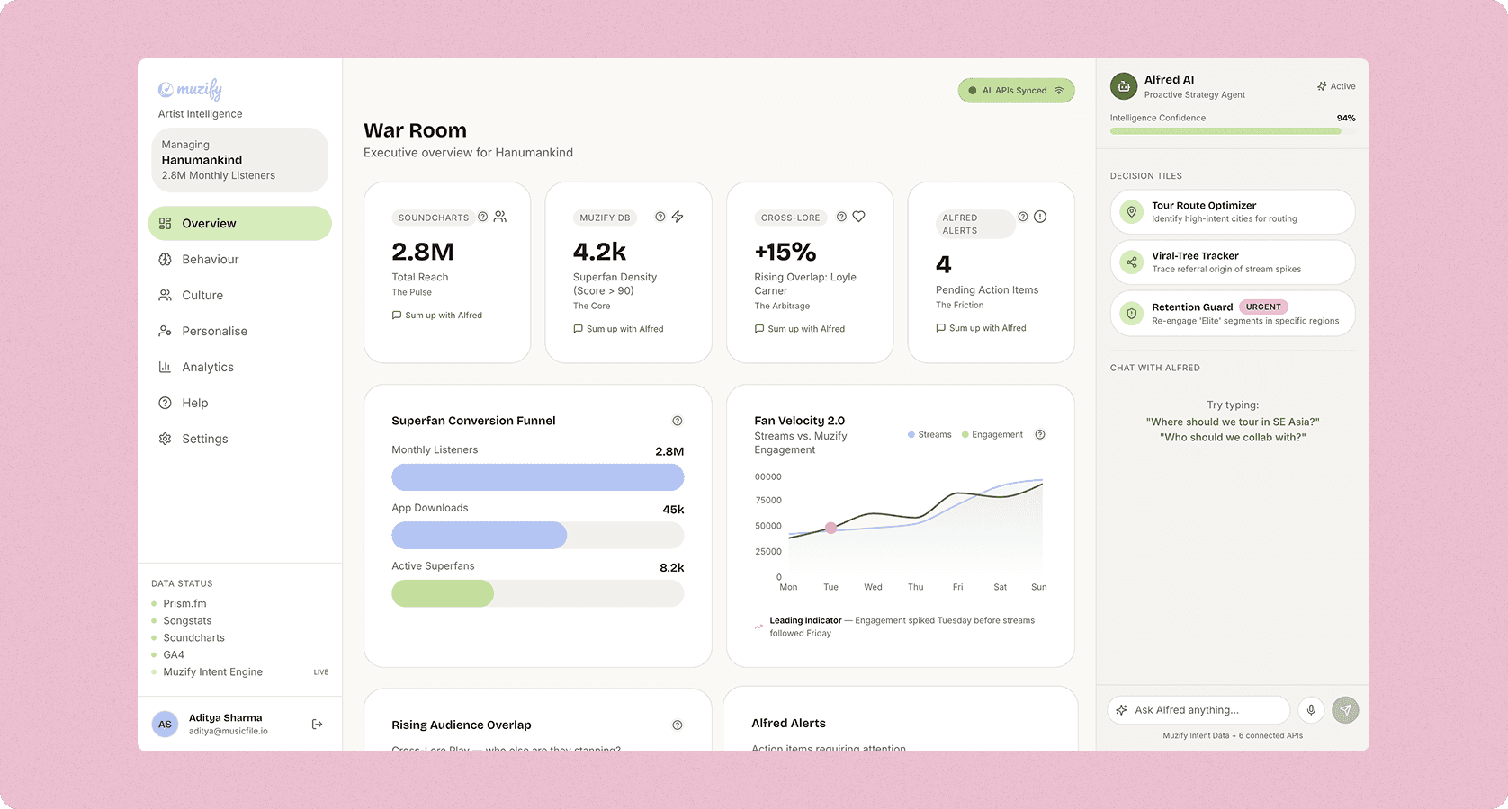
Cacta.ai is a B2B SaaS platform. It allows SMB freight forwarders to compare spot and contract rates from multiple carriers in one place. The goal sounds simple: find the cheapest rate from Toronto to Mundra. In reality, it required unifying a maze of carrier APIs, Excel sheets, surcharge logic, and validity dates into one interface for small teams.
This study covers the journey from pre-launch to closed beta. We tested every design decision with real freight forwarders before writing any production code.
Problem
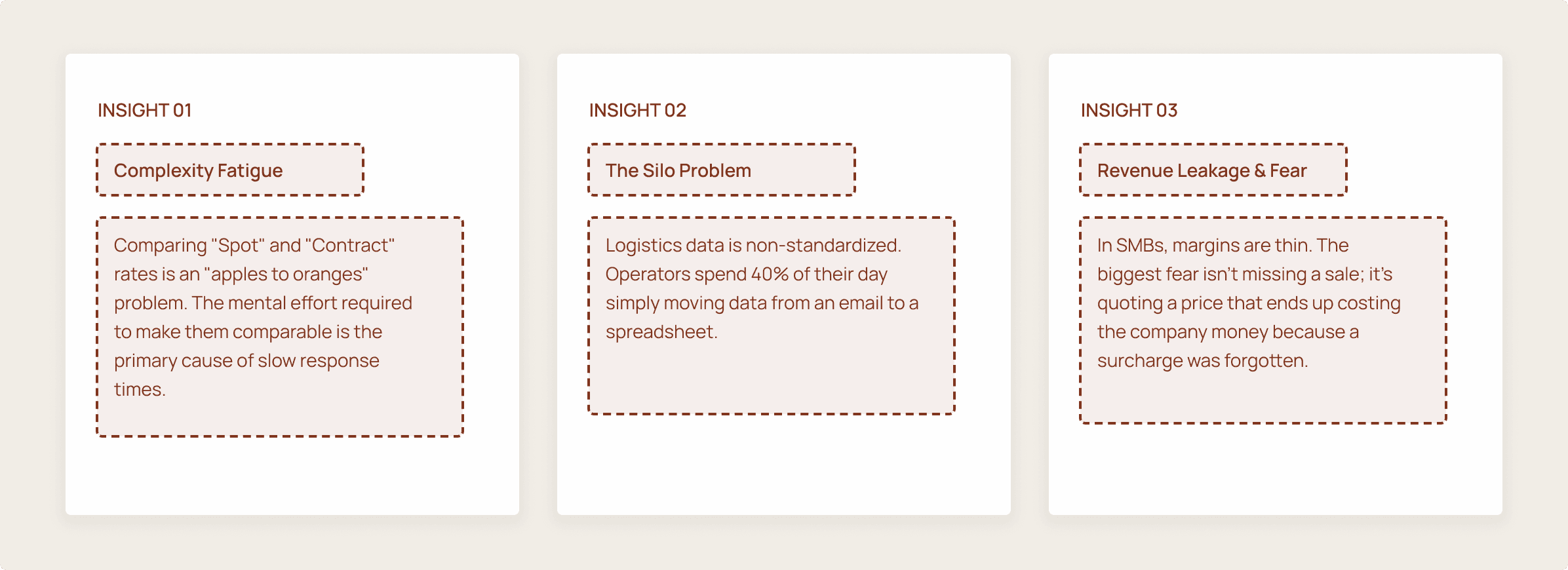
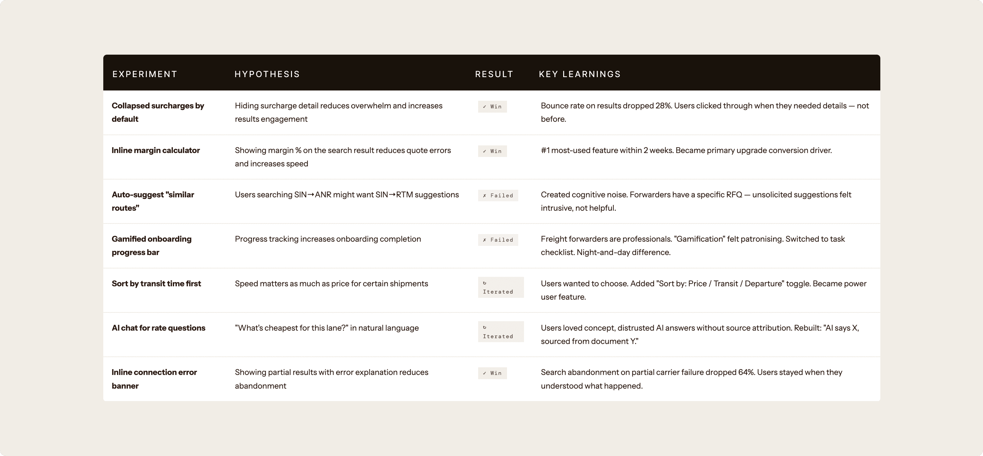
Seven tools. Thirty minutes. One quote. And one typo cost thousands.
Before Cacta, an SMB freight forwarder’s quoting workflow was a mess. They opened the Maersk portal to note a rate. They opened the MSC portal for another. They cross-referenced Excel sheets for contract validity. They checked Freightos for benchmarks. They pulled transshipment details from separate tabs. They calculated surcharges manually. Finally, they built a quote in an email and hoped nothing had expired.
The average quote took 30 minutes. A single missed surcharge or stale date could cost thousands of dollars. These small teams had no IT support and no room for error.
The real problem was cognitive load. A forwarder had to hold six data points in their head at once. They juggled carrier codes, commodity classes, and validity windows. All of this happened while trying to look confident for a client. Cacta exists to eliminate that mental burden entirely.
Research and Discovery
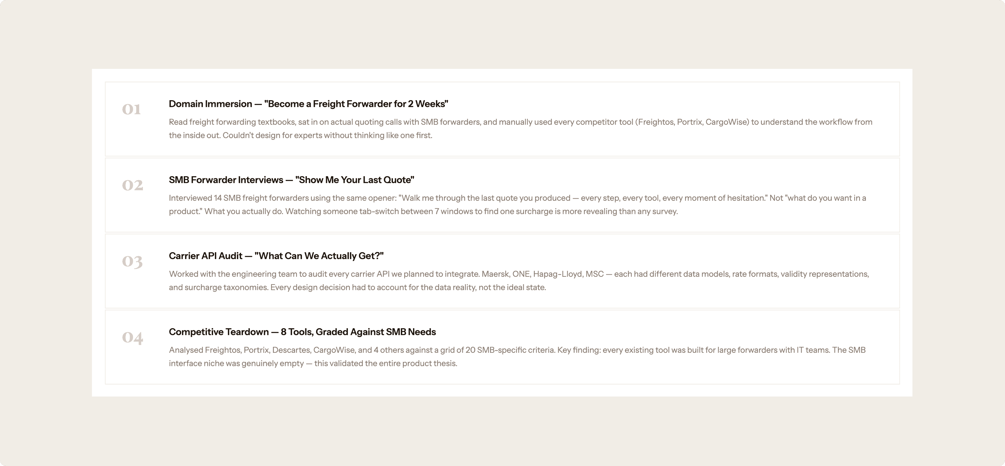
Domain Immersion First, Opinions Second
Freight forwarding is a domain you cannot fake. The vocabulary alone takes weeks to learn: FCL, LCL, BAF, PSS, THC. I spent my first two weeks purely learning the industry before touching a design tool. That discipline paid off in every stakeholder session that followed.
Ideation & Prototyping
Paper prototypes on Monday. High-fidelity tested by Thursday.
I ran a compressed design cycle: hand sketches on Day 1, Figma wireframes by Day 2, coded prototype (using Replit + AI assistance) by Day 4, user tested by end of the week. Every feature went through this loop at least 3 times before touching production.
Team & Cross-Functional Collaboration
Collaborating with the team
Solution
Every decision was earned through testing, not assumed from taste.
Retention Driver
Contextual Input Strategy
The freight journey often mixes modes, like a Port pickup with a Door delivery. Our first version used a global toggle that applied to everything, which was wrong. The final version puts independent "Port" and "Door" tabs above each location field. This sounds like a micro-decision, but it completely changes the carrier query. After three rounds of iteration and eight user tests, we landed here. Forwarders now see relevant results immediately instead of filtering through 40% irrelevant options.
Visual Hierarchy
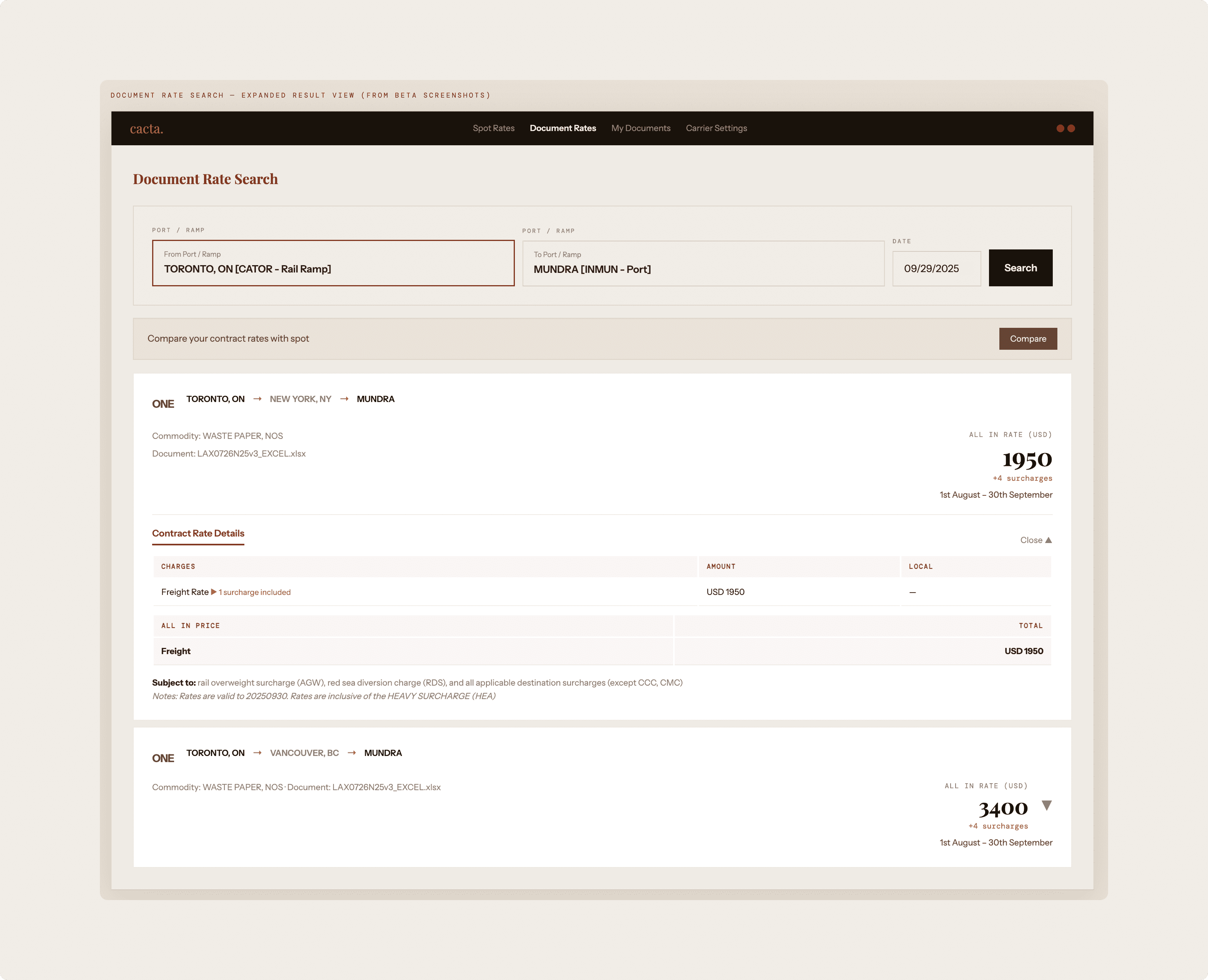
The "All-In" Price Anchor
Hidden surcharges are the top cause of lost trust in freight. We tested three price placements: left, center, and right-anchored. Right-anchored won every time. Forwarders told us the price is the answer to their question, so we should show it first and explain it later.
Information Architecture
Progressive Disclosure of Surcharges
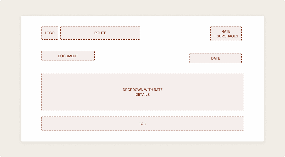
Freight quotes contain dozens of line items. Showing all of them creates overwhelm, but hiding them creates distrust. Our "Details Drawer" collapses everything behind a single click. A surcharge indicator tells the forwarder the detail is there when they need it. Including the source document name which serves as a deliberate trust signal for manual verification.
Feature Design
The "Compare" Bridge
Before Cacta, comparing a live spot rate against a negotiated contract rate required switching between portals and Excel files. We designed a "Compare" CTA that runs both searches simultaneously and shows them side-by-side. The challenge was showing results without losing search context. This feature became the primary driver for paid tier upgrades.
Error State Design
Global Command
Carrier API connections often fail due to aggressive rate limits or maintenance windows. Our original design showed a generic error that caused users to abandon the whole search. The redesign shows the valid results while using an inline banner to explain which specific carrier failed. It includes a "Review Connections" link that goes directly to settings. This transparency dropped search abandonment by 64% during partial failures.
Growth Design
Designing the product to sell itself as it gets used.
Learnings
What worked, what didn't, and what we learned either way.

What I'd tell myself on Day 1 of this project.
01: Experts Want Efficiency, Not Simplicity
My first instinct was to simplify the UI. Freight is complex, so the interface should be clean, right? Wrong. After research, I realized experts navigate complexity through density, not despite it. The pivot from "clean" to a "High-Density Command Center" was the most important design decision of the project. Expert interfaces shouldn't be simplified. They should be organized.
02: Earning AI Trust in B2B
The AI chat feature originally failed because users could not verify the answers. When we rebuilt it to say "AI says X, sourced from document Y," trust returned immediately. In high-stakes B2B environments, users do not need the AI to be more confident. They need to be able to verify the data themselves. Design for the verification path, not just the confidence display.
03: What I Would Do Differently
We designed the "happy path" first and treated error states as afterthoughts. In a product that integrates five carrier APIs, that is backwards. Carrier failures are not edge cases. They are regular events. I now believe in a "failure-first" design review before any feature ships. Our search abandonment numbers only improved once we prioritized the design of these error states.
04: Domain Immersion Before Opinion
Spending two weeks learning freight forwarding before touching a design tool felt like a risk on a 12-week timeline. It was actually the opposite. Every stakeholder conversation and engineering handoff was faster because I spoke the language. You cannot design for experts without learning to think like them.
Next work