B2C, HealthTech, Wearables
Turning biometric data into daily habits for 100k+ users
I translated invisible biological data into a human-centric visual language, bridging the gap between sophisticated hardware and daily health habits.

Overview
At Ultrahuman, our CGM (Continuous Glucose Monitor) tracked glucose in real time. The data was excellent, but we hit a wall: users didn't understand the numbers and stopped logging within a week. My job was to bridge the gap between clinical data and daily habits without stripping away the complexity.
Raw glucose data lacks immediate meaning. Traditional logging feels like a chore. It shows "what" is happening through jagged curves but never explains "why." This causality gap leads to data fatigue instead of behavioral change.
I chose this case study because it represents the full design stack: deep user research, emotional safety design, gamification logic, and hardware-software integration. Every layer was essential to the next.
Problem
Users had data. They had zero context.
When users received their CGM, they were immediately lost. Support was getting 3,200 tickets a month. Most of them asked the same things: "Is this number bad?" and "Why did my glucose spike?"
Users had the data but no context. The onboarding process assumed knowledge they didn't have. That first scan felt clinical and anxiety-inducing instead of empowering. Most users opened the app, saw a random number, had no idea what to do, and simply closed the app forever.
The Context Gap: A number like "140" is just a digit without a baseline. For a non-diabetic user, seeing a spike after a meal felt like a failure rather than a natural biological response. We realized the product wasn't just tracking a metric. It was trying to teach a new language.

Research and Discovery
Designing for emotional safety around health data
Health data is inherently stressful. I conducted interviews with both non-diabetic fitness enthusiasts and health-focused users to define a "Sympathetic Voice" and map the emotional states the product needed to navigate.
Users often viewed glucose spikes as personal failures rather than neutral data points. By shifting the product's "Sympathetic Voice" to prioritize emotional reassurance over clinical explanation, I collaborated with doctors and nutritionists to develop a "Nudge Logic" response library. This system transforms raw biometric data into actionable, contextual interventions such as suggesting a ten-minute walk to blunt a high spike or providing positive reinforcement for stable glycemia, ensuring that diabetics feel safe and biohackers receive the granular velocity breakdowns they crave without the burnout of data fatigue.
Starting before the app opens
I identified the biggest friction point was "First Scan" anxiety. We moved the onboarding flow out of the app and into the physical delivery. This was the most unconventional decision of the project and the highest-impact one.

Team & Cross-Functional Collaboration
Design acts as the bridge between hard science and user behavior.
CX (Customer Experience) & Support
Closing the Feedback Loop: Transformed raw support tickets into a prioritized design roadmap, identifying "friction peaks" where users struggled to interpret complex glucose or sleep data.
Proactive Education: Designed contextual tooltips and "in-app explainers" based on frequent CX queries, reducing the volume of repetitive support requests by addressing user confusion before it led to a ticket.
Engineering & Development
Systemic Handoff: Developed a robust design-to-code pipeline for complex data visualizations, ensuring that high-fidelity charts remained performant across different mobile devices and screen sizes.
Feasibility Partnering: Collaborated during the ideation phase to understand technical constraints of real-time data syncing, allowing for design solutions that balanced "live" feel with battery optimization for wearable tech.
Data Science
Visualizing Insights: Worked closely with data scientists to translate raw biometric data streams into "human-readable" scores (like the Recovery or Metabolic Score), turning abstract numbers into actionable health narratives.
Defining Success Metrics: Partnered to set up A/B tests and tracking events that measured how specific UI changes influenced long-term user retention and habit formation.
Medical Experts (Doctors & Nutritionists)
Clinical Accuracy vs. Usability: Conducted design reviews with medical professionals to ensure that simplified health insights remained scientifically accurate and didn't mislead users regarding their physiological state.
Evidence-Based Interventions: Translated clinical recommendations into "Nudge" UI components, ensuring that nutritional advice was delivered at the right physiological moment (e.g., after a glucose spike) for maximum impact.

Solution
What we actually shipped
Hardware × Software
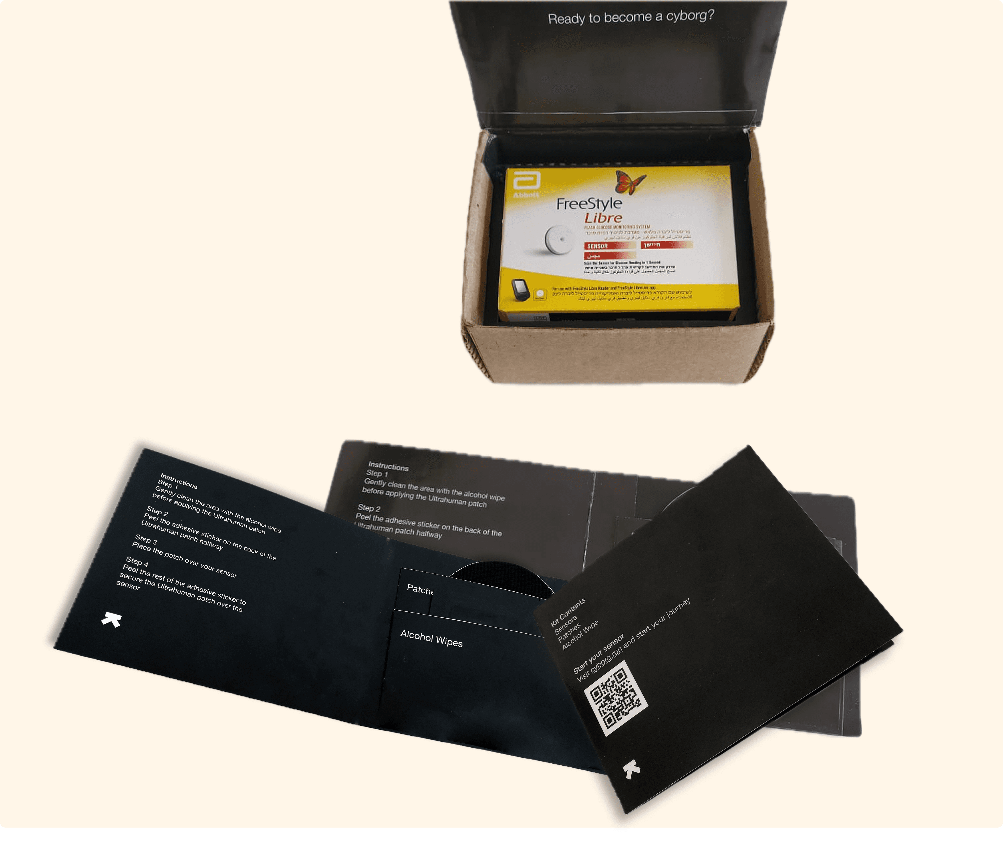
Physical-First Onboarding
We moved onboarding from the screen to the hardware itself. By embedding a "Scan-Eat-Log" printed guide inside the CGM box, we met the user the moment they opened the package. A QR code deep-linked to the exact in-app moment they needed, bypassing the "cold-start" problem entirely. This reduced first-week churn by 34%.
Information Architecture
The Metabolic Score (1–10)
Raw mg/dL numbers are intimidating for non-clinical users. We replaced them with a single 1–10 Metabolic Score as the primary metric. The deep clinical details remained available but were moved two taps away. By turning a confusing number into a clear daily goal, we saw D30 retention rise by 28%.
Content Design
Contextual Nudge Library
I worked with doctors and nutritionists to build a "Response Library" containing over 80 templates. We replaced clinical alarms with empathy. If a user had a high spike, the app suggested a walk. If they were stable, it offered encouragement. Support tickets fell 67% within 90 days of launch.
Gamification
Food Score Gamification Loop
We gave every meal a "Food Score." Users naturally began chasing scores of 8 or higher. This shifted logging from a chore to an experiment. We added streaks, weekly summaries, and personal bests to keep the momentum going. Daily active logging increased by over 45% in the first two months.
Proactive Design
Proactive Educational Toasts
The 24-hour sensor warm-up period is a high-anxiety window for new users. We used this time to surface bite-sized education: "Glucose rises naturally after meals—this is normal." By answering questions before they were even asked, we moved from a reactive support model to a proactive one.
Growth Design
Six loops built for sustainable habits

Learnings
Learnings & reflections
Friction as a feature: A well-placed tooltip at exactly the right moment isn't annoying. It's the thing that keeps a user from quitting. Timing is everything.
The voice of health is a balancing act: Too clinical and users feel anxious. Too casual and they don't trust the data. 'Why' always lands better than 'What.'

Next work
